Weber County White Kitchens With Color: Fresh Ideas To Keep A Classic Space From Feeling Plain In 2026
White kitchens still earn their place in Weber County homes. They reflect light beautifully, make busy family spaces feel bigger, and give us a timeless foundation that won't feel dated in a few years. But let's be honest, an all-white kitchen can also drift into "builder basic" if the details aren't handled well. In 2026, the smartest approach is keeping the crispness people love while layering in color, texture, and warmth in ways that feel intentional. That's where good design matters most, especially in Utah homes where light, climate, and everyday family life all shape what actually works.
Why White Kitchens Still Work So Well In Weber County Homes
White kitchens fit Weber County for a few practical reasons. First, many homes along the Wasatch Front deal with big swings in natural light, bright, reflective summer sun and darker winter days. White cabinetry helps bounce that light around, which keeps the room open and clean instead of heavy.
There's also the resale factor. A well-designed white kitchen has staying power because it works with farmhouse, mountain modern, traditional, and transitional homes. That flexibility matters when homeowners want a remodel that feels personal now but still broadly appealing later.
From our side of the industry, white also makes craftsmanship more visible. Clean reveals, crisp shaker profiles, and well-fitted custom cabinets Utah homeowners invest in tend to stand out more in lighter finishes. Of course, white only works when it's built well. In Utah's dry climate, cheap painted doors can show cracks at joints over time. That's why material selection, construction quality, and finish prep matter just as much as color.
How To Add Color Without Losing The Clean, Bright Look
The trick isn't adding a lot of color. It's adding color in the right places.
We usually recommend treating white as the backdrop, then choosing one or two supporting tones. That could mean a painted island, a richer hood detail, colored backsplash tile, or even warm wood cabinetry mixed into the layout. When every surface competes, the kitchen feels busy fast. When color is controlled, the room still reads bright and polished.
A good rule: keep the largest light-reflecting surfaces light. Perimeter uppers, walls, and countertops often do the heavy lifting there. Then use color where the eye naturally lands, an island, lower cabinets, pantry door, or bar area.
This is also where 3D renderings help. At Caliber Cabinets, we like showing homeowners exactly how navy, green, or charcoal will sit next to white before installation starts. It's much easier to be bold when you can actually see the balance in advance, instead of hoping a paint chip tells the whole story.
Cabinet Color Ideas That Pair Beautifully With White
Some color pairings simply work better than others, especially in a white kitchen meant to stay current beyond one trend cycle.
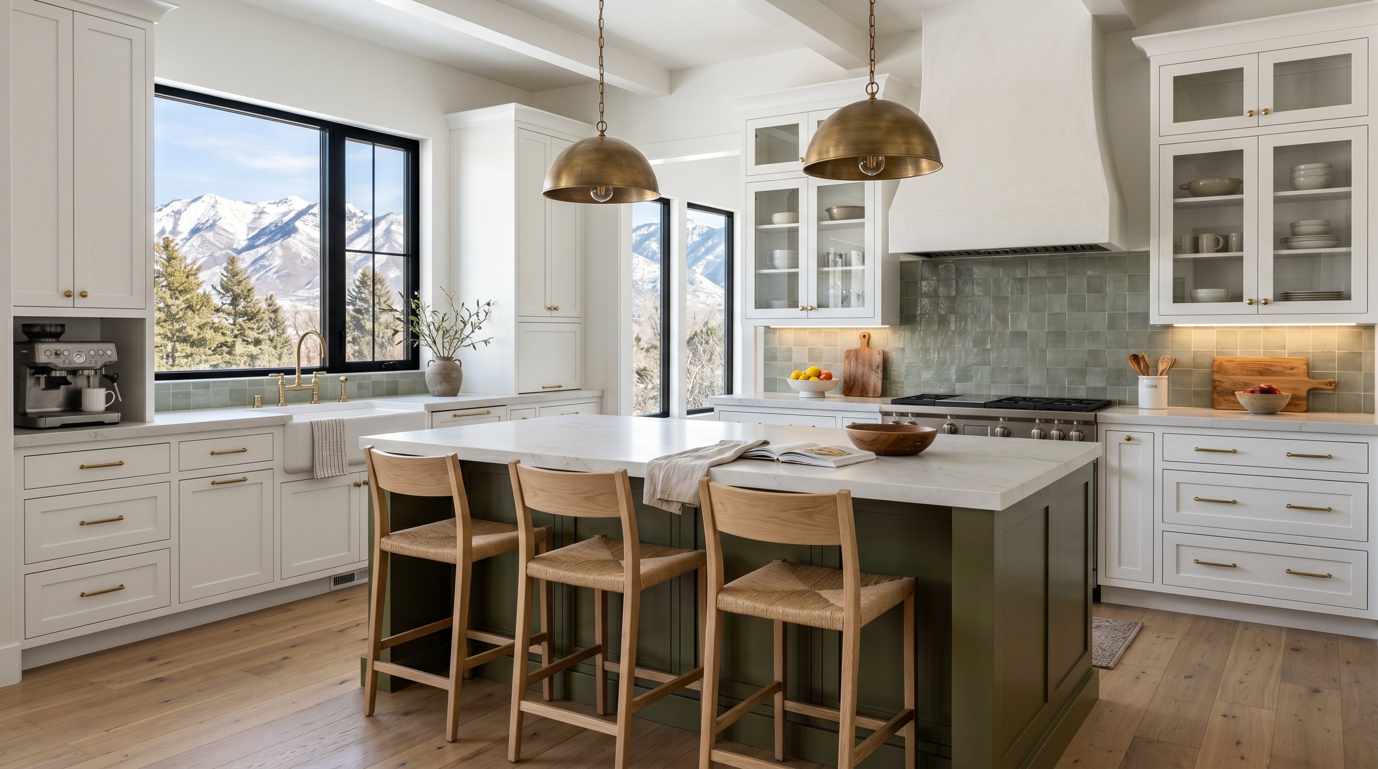
Deep green is one of our favorites for 2026. Hunter or olive-toned cabinets bring in depth without feeling harsh, and they pair especially well with brass, oak, and warmer stone. Navy is another reliable choice. It adds contrast, feels classic, and works across coastal-inspired, traditional, and mountain modern homes.
Charcoal or soft black creates a sharper, more architectural look. If a homeowner wants something moodier without going fully dark, this is often the sweet spot. And for a softer approach, muted blue-gray or greige can introduce color while keeping the overall palette calm.
Natural wood deserves a place in this conversation too. A Rift-Sawn White Oak island beside white shaker cabinetry adds color through tone and grain rather than paint, which often feels richer and less trendy over time.
Best Places To Introduce Color In A White Kitchen
If you're hesitant, start with the island. It's the easiest place to create contrast without overwhelming the room. We also like color on lower cabinets, because it grounds the kitchen while allowing uppers to stay airy.
Other smart spots include a built-in coffee bar, an appliance garage, a hidden pantry entry, or even interior cabinet lighting inside a darker glass-front hutch area. These moments add personality without taking over the whole space.
Warm Vs Cool Color Palettes For Utah Light And Finishes
Utah light changes everything. It's bright, crisp, and pretty unforgiving, which means paint undertones show up fast.
Warm palettes tend to feel more comfortable in Weber County homes, especially when paired with wood flooring, warm metals, or creamy countertops. Think soft white, sand, taupe, muted green, and natural oak. These combinations counterbalance the cooler cast that can come from northern exposure or winter light.
Cool palettes can absolutely work too, but they need discipline. True bright white with icy gray or blue can look sleek in the right home, especially with polished finishes and lots of daylight. But in some spaces, it can also read sterile. That's the line we try not to cross.
One practical tip: test samples at different times of day. Morning light, overhead LED lighting, and evening shadows can make the same cabinet color look like three different decisions. We usually advise homeowners to choose the countertop first, then flooring, then cabinet color. It saves a lot of second-guessing and helps the whole palette feel tied together.
Choosing Materials And Textures That Make Color Feel Intentional
Color looks best when the surrounding materials support it. Otherwise, even a beautiful green or navy can feel dropped in rather than designed.
Texture is often the missing piece. White kitchens benefit from contrast in finish and feel, matte paint against polished quartz, warm wood grain against smooth cabinet faces, handmade tile against clean slab counters. That layering keeps the space from feeling flat.
In Utah, material performance matters too. For painted finishes, we often recommend HDF center panels because they hold up better in our dry climate and help reduce the cracking and movement you can see with lower-grade options. If the design includes stained oak or walnut, the finish should be selected with the home's light level and traffic in mind, not just what looked good on social media.
Hardware also does more than people think. A white kitchen with green lowers and unlacquered brass pulls feels very different from that same kitchen with matte black hardware. Add integrated LED cabinet lighting, deep drawer storage, and custom countertops Utah homeowners actually use hard every day, and the result feels cohesive, not accidental.
Conclusion
White kitchens aren't going anywhere, and they shouldn't. In Weber County, they make sense. The update for 2026 is adding color with restraint, using better materials, and designing around real life instead of just inspiration photos. When we balance white cabinetry with wood, moody paint, smart storage, and durable finishes, the kitchen stays timeless but never boring. That's the sweet spot most homeowners are really after.