White Kitchen Paint: How To Choose The Right Shade For A Bright, Timeless Space In 2026
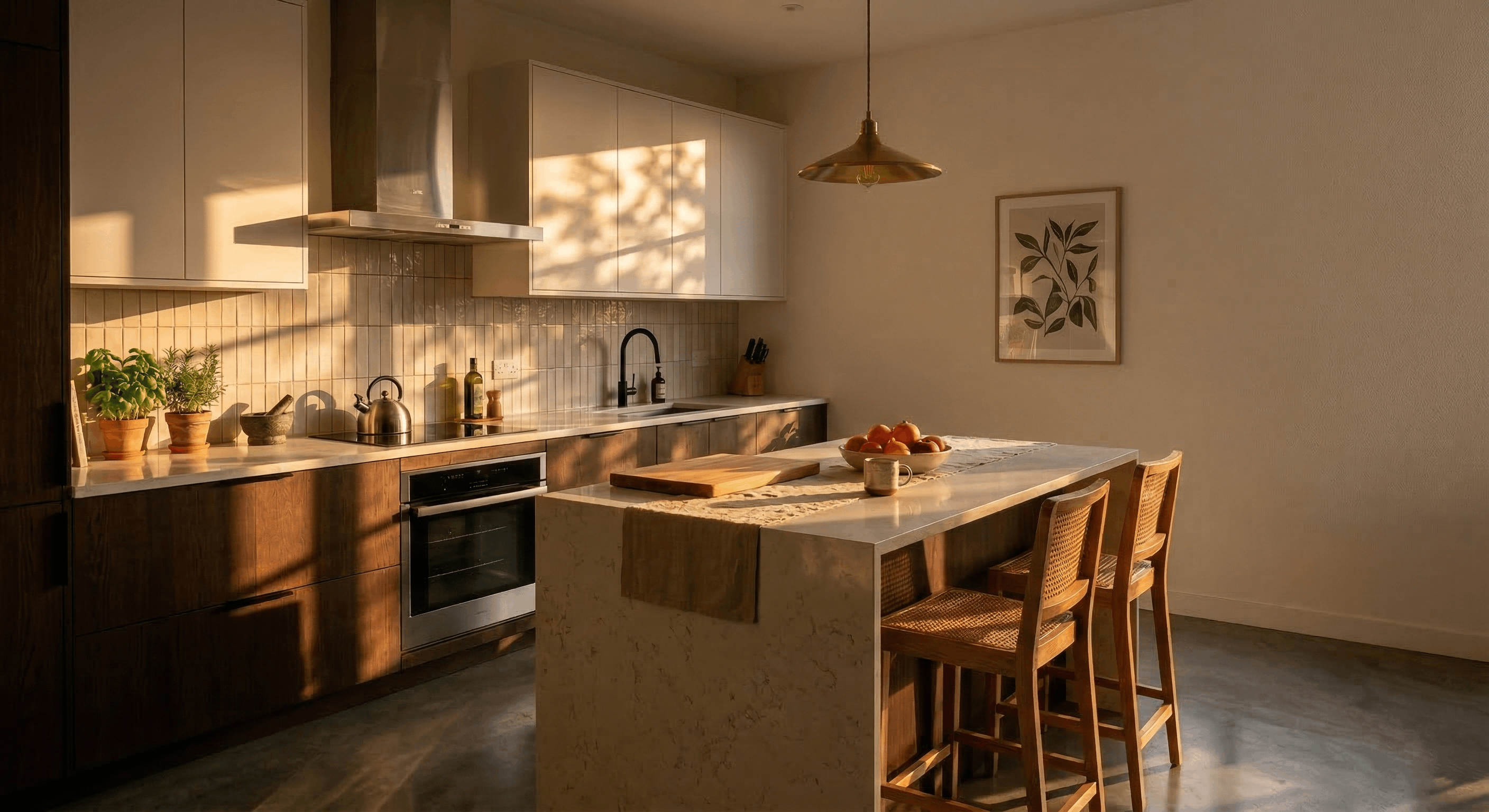
White kitchen paint sounds simple until you're standing in front of a fan deck staring at 40 nearly identical swatches. Then it gets very real. In Utah homes, the right white can make a kitchen feel brighter, cleaner, and more expensive: the wrong one can look flat, blue, or strangely yellow by dinner time. We help homeowners work through this all the time, especially during custom kitchen remodels where cabinets, counters, flooring, and light all have to play nicely together. Here's how we choose a white that feels timeless in 2026, not trendy for six months.
Why White Kitchen Paint Still Works In Modern And Traditional Homes
White kitchen paint has lasted this long for a reason: it adapts. In a traditional kitchen, it highlights crown molding, shaker doors, and warm wood floors without competing for attention. In a modern kitchen, it creates clean lines and lets statement pieces, like a waterfall island, dramatic hood, or matte hardware, stand out.
For Utah homeowners, white is also practical. Many homes along the Wasatch Front get strong daylight, and white helps bounce that light through the room, which matters in kitchens that face north or have deeper floor plans. It also pairs well with the materials we're seeing most in 2026, including natural white oak, soapstone-inspired quartz, brushed brass, and moody perimeter cabinets.
And no, white doesn't have to mean boring. A white kitchen can feel layered when we use texture: zellige tile, fluted wood, plaster-style hoods, or integrated cabinet lighting. In fact, some of the best remodels we design at Caliber Cabinets use white as the anchor, not the whole story. That's especially true in two-tone kitchens, where a soft white perimeter can balance a walnut or Rift-Sawn White Oak island beautifully.
How Undertones Change The Look Of White Paint
If there's one thing that separates a good white kitchen from a frustrating one, it's undertone. White paint is rarely a pure, neutral white. Most shades lean warm, cool, gray, cream, beige, or even faintly green. Those subtle shifts become obvious once the paint is next to cabinets, counters, backsplash tile, and natural light.
A paint color that looked perfect in the store can suddenly feel icy against creamy quartz or muddy beside bright white trim. That's why we never recommend choosing white kitchen paint from a tiny chip alone. Sample it on large boards, move it around the room, and check it morning, afternoon, and evening.
Warm Whites For A Softer, Inviting Kitchen
Warm whites usually have yellow, greige, or creamy undertones. They're a strong fit if your kitchen includes warmer materials like oak flooring, beige-veined quartz, brass hardware, or off-white backsplash tile. They tend to feel more relaxed and forgiving than stark whites.
In family kitchens, warm whites often win because they soften the whole space. Instead of feeling clinical, the room feels lived-in and welcoming. That matters if your kitchen opens to a great room with warmer furniture and wood tones.
But warm whites need restraint. Too much cream can make a kitchen look dated, especially with builder-grade lighting or heavily yellow floors. We usually steer clients toward balanced warm whites that still read fresh, not buttery.
Cool Whites For A Crisp, Clean Finish
Cool whites carry blue, gray, or faint green undertones. They work well in kitchens with polished nickel, marble looks, charcoal accents, or a more contemporary design language. If you love a crisp, gallery-like feel, a cooler white may be the right move.
These shades can be especially sharp with deep navy or hunter green cabinets in a two-tone layout. They create contrast and make architectural details feel cleaner.
The caution: cool whites can turn stark in Utah's bright daylight, especially in rooms with lots of snow reflection in winter. Under LED lighting, some can even feel sterile. We usually test these carefully before committing, because what reads "clean" on day one can feel cold a few months later.
How Lighting, Cabinets, And Countertops Affect Your Paint Choice
White kitchen paint never exists in isolation. It's always reacting to everything around it.
Start with lighting. North-facing kitchens tend to pull cooler, so a slightly warmer white often keeps the space from feeling flat. South-facing kitchens get golden light, which can intensify cream undertones. Then there's artificial lighting: warm LEDs can make some whites look yellow, while cooler LEDs can exaggerate blue-gray tones. This is one reason we like building realistic 3D renderings for clients during the design process, it helps people see how finishes will relate before installation starts.
Cabinets matter just as much. If you're painting walls around bright white cabinets, a wall white that's slightly softer often looks more intentional than trying to match exactly and missing by a hair. If you're doing cabinet refacing or full custom cabinets Utah homeowners often choose, we also think about durability and climate. In Utah's dry winters, painted cabinet finishes perform better when the construction and materials are chosen carefully, especially with stable HDF center panels that resist seasonal movement.
Countertops can push a white one way or another. A quartz with warm veining may make a cool paint look harsh. A bright marble-look slab can make a creamy wall color seem dingy. Always sample paint beside the actual countertop slab or cabinet door, not just a photo. Photos lie. Stone doesn't.
The Best White Kitchen Paint Finishes For Walls, Trim, And Ceilings
Color gets most of the attention, but finish affects how the paint lives day to day.
For walls, we usually prefer eggshell or satin in a kitchen. Eggshell gives a soft look and hides minor wall imperfections better, while satin is a little easier to wipe down around high-traffic zones. If you cook a lot, have kids, or know spaghetti sauce has a strong personality, satin can be worth it.
For trim, doors, and built-in details, semi-gloss is the usual choice. It's durable, easier to clean, and creates subtle contrast against flatter wall finishes. In a white kitchen, that slight shift in sheen can help the room feel layered even if the colors are close.
For ceilings, flat is still the standard. It minimizes glare and keeps attention where it belongs. In kitchens with tall ceilings or lots of natural light, a dead-flat ceiling can make the room feel calmer.
If you're painting cabinetry rather than just walls, that's a different conversation. Cabinet-grade finishes require the right prep, spraying process, and materials to hold up well, especially in Utah's dry climate. It's one reason many homeowners choose professionally finished custom cabinetry or refacing instead of treating cabinets like a weekend paint project. A beautiful white is only beautiful if it still looks smooth a year later.
Common Mistakes To Avoid Before You Commit To A White Kitchen
The most common mistake is choosing a white too fast. It sounds obvious, but people still pick a color from a small swatch under store lighting and hope for the best. White needs testing, large samples, multiple walls, different times of day.
Another mistake is ignoring fixed finishes. Your flooring, backsplash, countertop, and cabinet color should drive the paint decision, not the other way around. We've seen homeowners fall in love with a trendy bright white, then realize it clashes with warm travertine floors or creamy quartz.
A third issue is forcing a perfect match. Matching wall white to cabinet white rarely works unless everything is selected together with precision. Slight contrast usually looks more refined.
And finally, don't forget lifestyle. Super-bright whites can show every scuff, fingerprint, and shadow. If your kitchen is the command center for a busy family, a softer white may age better. That's usually the sweet spot we recommend: bright enough to feel fresh, nuanced enough to feel timeless.
If you're remodeling and want to see how paint, cabinetry, countertops, and lighting will actually come together, that's where a full design plan helps. We use in-home consultations and 3D renderings to remove the guesswork, so the white you choose on paper still looks right once the kitchen is built. Get the shade right, and a white kitchen doesn't just stay in style, it stays easy to live with.